One can’t deny the amount of animated stories that come from adapting fairy tales. Hell, the amount of fairy tales that moved to live action in the past five years to appeal to teenagers is staggering. Although we expect to see quite a few live-action re-tellings of a number of animated Disney classics, Maciek has seen a fairy tale Disney would never, ever touch at the Annecy Film Festival.
Reader discretion is advised for wavy lines and European Nihilism.
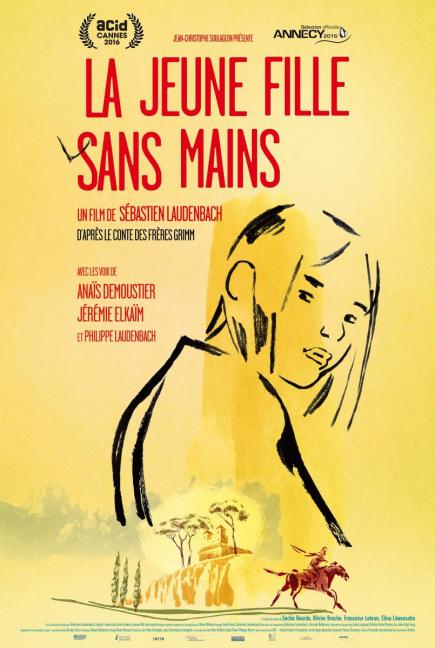
The Girl Without Hands (Le Jeune fille sans mains)
Once upon a time, there was a daughter of a very poor miller. She was sold in desperation by her father to the devil, and in return for selling her into slavery, the water in his mill turned into gold. However, the demon couldn’t take the girl, as she was “too clean.” So the miller forced his daughter to spend days in a tree, and through her body became filthy due to her exposure from the elements, her hands remained clean due to her constant weeping. So, the father decided to chop off his daughter’s hands to appease the devil, but when that doesn’t work, the girl sets out on a journey, hoping to not only escape from her father, but go on extraordinary adventures.
I would write more, but I’m sure you’re already familiar with this old children’s classic, right?
Honestly, it’s hard to talk about ‘The Girl Without Hands’ without spoiling too much about it. I noticed that it featured plenty of familiar tropes often seen in countless classic fairy tales, including ‘Rumpelstilskin’ and ‘Snow White,’ and lo and behold, I learned that the movie is in fact based on a very obscure Grimm’s Fairy Tale.
The original, also known as ‘The Handless Maiden,’ was originally a very Christian-centric story, though this recent film adaption tones that down significantly. Despite featuring an overly-familiar plot, the film’s greatest success is its visuals, and how the film’s director, Sebastien Laudenbach, chooses to convey the story through those visuals.
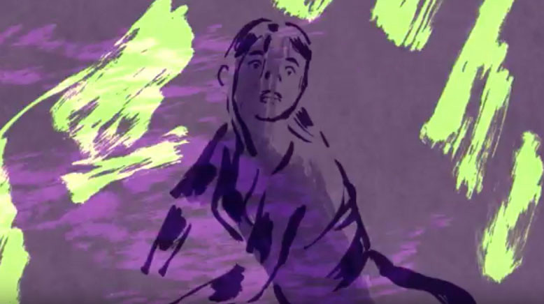
The artistry of the film is a character in itself. The backgrounds are very simplistic, and sometimes only feature a few ink blots or lines on a significant amount of white space to symbolize a location. Though the backgrounds are simplistic, I never felt lost or confused when the film switched from place to place. Even the characters themselves are just sketches with some spots of color on them. Despite this artistic choice, Laudenbach still manages to convey the emotions of his characters by the way in which their line outlines are displayed. When a character is sick or dying, their lines begin to fade, and when another character is scared, their lines look erratic and shaky. These neat visual designs, while unusual, give the film an even greater sense of originality that set it apart from most CGI and classic 2D animated fare.
Though the film is bold with it’s animation, the central storyline is significantly less so. Certain plot points are not explained very well, and the movie often relies on “fairy tale logic” to get from one point in the story to the next. Additionally, the film is definitely NOT for children, and features a number of gory and disturbing body horror moments. There are also a few brief moments of humor, but even these scenes can get incredibly bizarre and morbid.
Even though the story stumbles , I really loved the film’s nameless heroine, and how we see her adapt and think of solutions to problems despite not having hands. “The Devil” was also a very effective and disturbing villain, and he’s made all the more creepy by the fact that we never actually see his “true” form throughout the film.
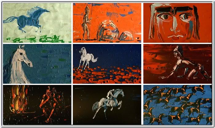
‘The Girl Without Hands’ is at its best during its quiet moments and thoroughly excels when trying to set a specific mood. At times, it even reminded me of a glass-painting animation by Polish artist Witold Giersz, which perfectly conveyed the expressions of emotions. It’s also nice to see a long forgotten fairy tale get some much needed attention, as I don’t see Disney tackling this one any time soon.
Now that story is DARK, and I’m not just talking about the shadows. It uses a familiar style I’m starting to notice in foreign films like The Boy and The World, that use a scribbly, flat color to show off the movie’s necessary fluidity (or lack thereof). There’s a lot of silence and the environment itself almost comes off like its own character. The closest example it reminds me of is that bizarre scene from Rugrats where Chuckle talks about a day in his life, that is super depressing; featuring black backgrounds and rain clouds against his chalk drawings.
There’s a pleasantness in the movie’s simplicity. Most Disney fairy tales have to change the overall plot or moral of most fairy tales to satisfy children, but this is certainly staying true to the Brothers Grimm original. A lot of fairy tales have very sudden punishments or gruesome endings, like the Cinderella step-sisters chopping their feet to fit in the glass slippers. Nevertheless, it gives the fairy-tale a refreshing, meditative take on a devious story…which is rare from an adaptation. I believe it will have very strong impact on that audience, especially when compared to the very expressive, melancholy Giersz artwork.
I’m wondering if that has the potential to be its own movie versus say a short, but Maciek’s recommendation has me curious. I hope to catch it sometime soon.

